Error is a natural part of the creative process, but, we’ve all been there!
Sometimes, I add too many elements that clutter the illustration. However, it’s always possible to stop and review my steps later, and I completely understand the frustration of not getting the desired result in my drawings.


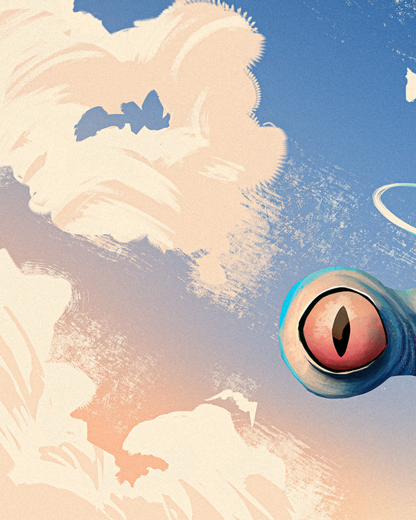
When I was trying to draw a scene with a giant amphibian god surrounded by mountains, I used a colour palette from pantone.com, specifically the new Pantone 2024 (Peach Fuzz).

During the process, I had to accept that I didn’t know everything. I constantly looked for references, such as photographs or drawings by other artists. I took suggestions, stopped, laughed, drank water, and changed the music. All of these things helped me.
One of my goals was to use more shadows in my drawing to stop being “afraid of the dark”. I find that in order to begin to master a subject, I need to use something that makes me laugh (alien god) along with a subject that is out of my comfort zone (aquatic-amphibian). This way I can learn and practice other things like: character design, silhouette, practice and play with brushes in Photoshop that I don’t normally use.


Good or bad, I feel that I have achieved my goal, and even if the technique can still be improved, at least I have a piece of work that is completely out of what I have been drawing lately.
I am constantly learning, and besides, it’s fun.
